

Recent Comments
Mr WordPress on Hello world!

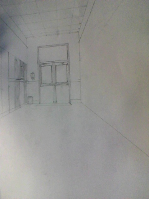


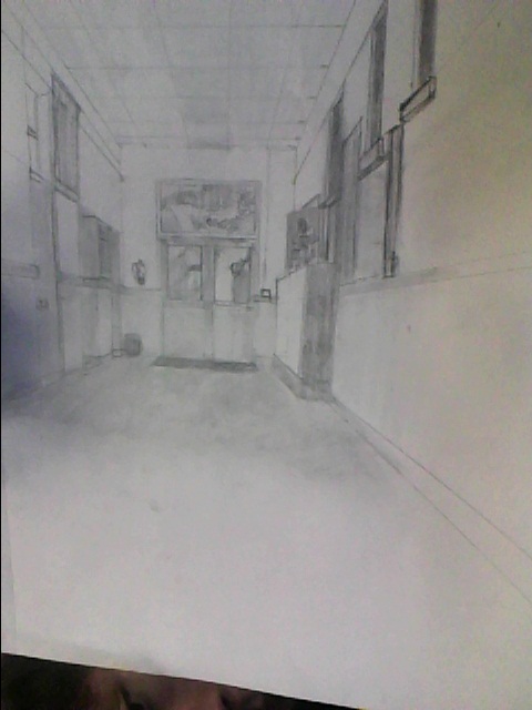


The one point drawing was my favorite drawing this year. It was very difficult and challenging to draw. This was a drawing that you could not be lazy on. I felt like I did a decent job, but I was rushed in the end so I could not detail as well. The angles took a while to do, but when I finally got the hang of it, it was much easier to do. Doing this drawing, I realized that your eyes have to see things that make drawings great. I really though what made it so hard to draw was the pictures on the wall. When I was drawing the book shelf, it took me a while to figure it out. This was a great learning experience for me. I wish we had a little more time on it because I think I could have done a better job on the detailing and shading.


Artist: Kathryn Kerls
Title: room 2
Dimension: 14x 16”
Media of each work: Graphite on paper
Why you chose it: The dark setting caught my eye when I was browsing pictures
What about the reference image you can integrate: The artist set the drawing in a dark mood by only using one light source. This makes the shadows more dramatic and shows details better
Some interesting factoid about the artist(s). She went to the Art institute of Houston
Artist: Justin Owens
Title: twopointperspective
Dimension: 14x 16”
Media of each work: Ink, graphite, and water color on paper
Why you chose it: The idea of an alchemist’s house is creative
What about the reference image you can integrate: He used multimedia to create a dark and creepy mood
Some interesting factoid about the artist(s). He enjoys watching sci-fi movies
Artist: Charles Phillip Meyette
Title: Beach house draft
Dimension:13x 14”
Media of each work: graphite on paper
Why you chose it: The detail on the house and the tree are extraordinary
What about the reference image you can integrate: he took a long time to make the picture look perfect
Some interesting factoid about the artist(s). He was born in Indiana


Artist: Andrew Diec
Title :First Point Perspective Street
Dimension: 8.5×11”
Media of each work: Pen on Paper
Why you chose it: The Perspective is very interesting
What about the reference image you can integrate: He studied the angles in the street for a long time
Some interesting factoid about the artist(s). he also does clay sculpture
Artist: Kate Bozzelli
Title :First 1 point perspective cafe
Dimension: 8.5×11”
Media of each work: Pen on Paper
Why you chose it: The angles are very realistic
What about the reference image you can integrate: She took a lot of time on the lights on the ceiling
Some interesting factoid about the artist(s). She is a graphic designer
Artist: Dan Hudock
Title :First point exit
Dimension: 8.5×11”
Media of each work: Pen on Paper
Why you chose it: The drawing is very realistic and the doors looks very good
What about the reference image you can integrate: He used the one point perspective to make the correct angles
Some interesting factoid about the artist(s). He was in art school in 2006


The pen and ink drawing was my favorite project this year. I have never used pen and ink before so this was a new experience for me. I thought the gridding is a very helpful and useful style. As I went farther into my ink drawing, I became better at it. I think if u did this again it would be better because now I have used the quill. I think that the grass was very difficult for me. I think the roof came out good, but I think I could have spent a little more time on it. The artist that made the original pen and ink must have been very experienced because there were no splatters. Pen and ink is much different than any other medium than I have used and I hope that I can use it again because it is a great medium for my artwork.


When I began drawing this I realized how difficult it was to draw a leaf. A leaf is very difficult because of the stem; it seemed to be lighter than anything other than leaf. As I continued to draw it, I realized the shading was a lot very difficult. Doing this over a period of 3 days changed the leaf and made it more difficult. I thought the toughest part of the leaf, besides the stem, was the outer edge. I tried to make the outline of the leaf that I made at the beginning of the sketch go away with shading, but the more I did it, the more awkward it looked. I really hope we do this project again because it was very fun and I learned a lot on how to draw a leaf. Hopefully the next time we do this, I will do better with my new experience from this project.


Artist: Kelli Swan
Title: Pen and ink house
Dimension: 8 x 10”
Media of each work: Pen on Paper
Why you chose it: the reflection of the bush in the window in amazing
What about the reference image you can integrate: This drawing took a lot of time and much use of the ruler.
Some interesting factoid about the artist(s). She loves Doberman pinschers
Artist: John Sheather
Title: Kew Green Church
Dimension:6×8”
Media of each work: Pen on Paper
Why you chose it: it is very interesting that for shading, he splattered ink instead of hatching and crosshatching
What about the reference image you can integrate: The point of this drawing is to show the shadowing.
Some interesting factoid about the artist(s). He was born in west England
Artist: Kandy Radzinski
Title: Mr. Watson with teddy
Dimension:8.5 x11
Media of each work: Pen on Paper
Why you chose it: The dog is very detail and the rug he is laying on caught my eye
What about the reference image you can integrate: the artist did a great job on crosshatching and hatching under the dog
Some interesting factoid about the artist(s). the artist is obsessed with Scottish terriers


When i first started this drawing i was very nervous. I’ve never done a still life drawing before. I kept thinking that i was going way too fast for the outline. over time i thought it looked better. Doing the background was very tough. The shading on this was very hard. The color of the sheet in the back was difficult for me to get. I believe that this was a decent drawing. I feel now that if i do this again, i will have more experience for still life. I thought that throughout the days i learned more and more correct angles and techniques for shading. I think i could have improved on the shading and the background. I possibly could have also improved on some angles and shapes and the reflecting from the lights above. I liked all the things together, it was a great challenge to get all the items put together right


Artist: Fred Feguer
Title: the Study
Dimension: 8 1/2X11”
Media of each work: Graphite on paper
Why you chose it: the shading was amazing; it actually looked like a woman and the detail showed the beauty of the woman.
What about the reference image you can integrate: the lighting on the hair was very, very detailed and the artist spent a lot of time on drawing that part.
Some interesting factoid about the artist(s). he has only sold one of his drawing in his entire life
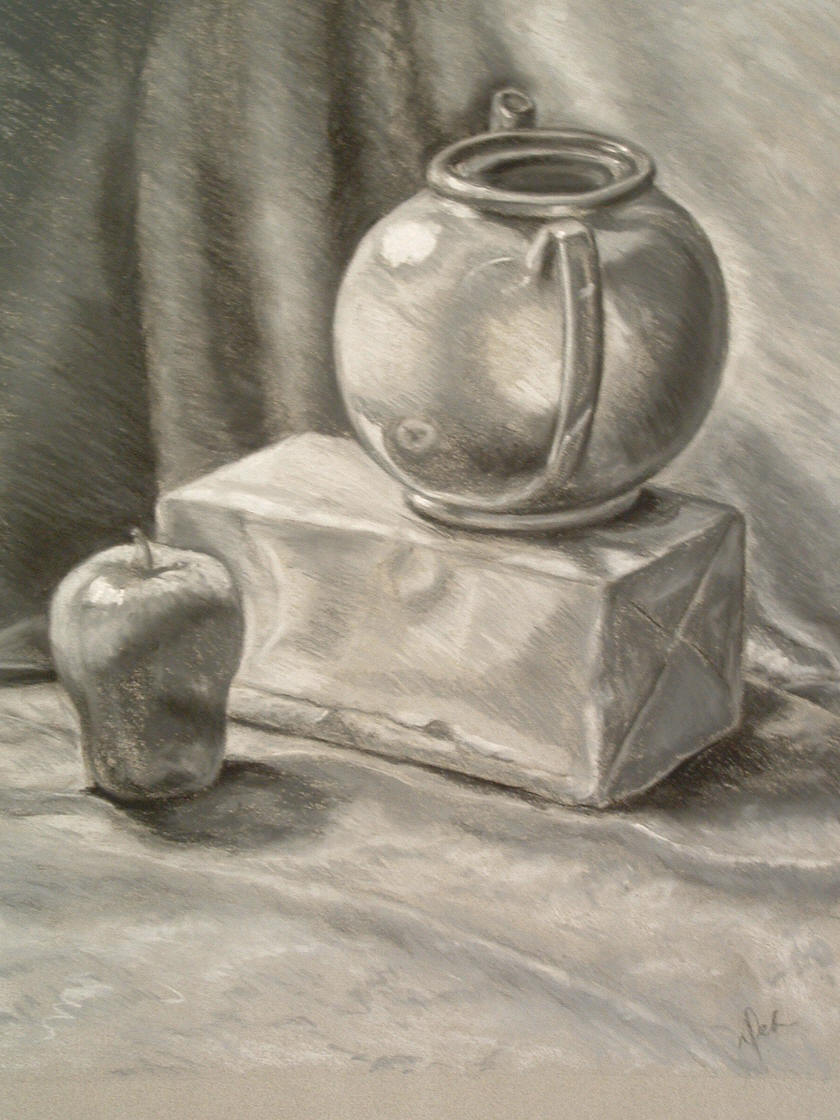
Artist: Deborah Mitchell
Title: Still life one
Dimension: 8 1/2X11”
Media of each work: Graphite on paper
Why you chose it: the pot was very realistic and the light made it look even better. It showed refection well
What about the reference image you can integrate: the curtain in the background had great shading and the apple refection in to pot was good as well
Some interesting factoid about the artist(s). She was born in Caracas
Artist: Fred Feguer
Title: Lori Feguer’s Shoe
Dimension: 11×8 1/2”
Media of each work: Graphite on paper
Why you chose it: the shoe looks so realistic , the shading and the shape are extremely good, but the detail is what amazes me
What about the reference image you can integrate: the detail on the lace is incredible and the heel is very realistic
Some interesting factoid about the artist(s). his mother is a great inspiration to him


Artist: Joy Nagy
Title: Graphite Leaf Study
Dimension: 18X24”
Media of each work: Graphite on paper
Why you chose it: The holes in the leaf made the drawing more difficult and the artist still made it great
What about the reference image you can integrate: I liked the stem and how she made the lead curve, it shows dimension
Some interesting factoid about the artist(s). she does watercolor as well
Artist: Jamey Lee Balester
Title: Leaf Study IV Drawing
Dimension:9X12 “
Media of each work: Graphite on Paper
Why you chose it: the leaf looks very detailed but at the same time it is blurry
What about the reference image you can integrate: The leaf is very realistic on shape and the shadow seems to fit the leaf well
Some interesting factoid about the artist(s). She was born in Huntington Beach, CA
Artist: Dee Overly
Title: Leaf Study
Dimension: 14X17”
Media of each work: Graphite on paper
Why you chose it: The leaf caught my eye because of how realistic it is and the great shading
What about the reference image you can integrate: the detail is great and the shading is amazing, but what was the most interesting was the angle he drew in on.
Some interesting factoid about the artist(s). He built neon signs for 7 years
| Mr WordPress on Hello world! |
